LAUREN LOUISE DESIGN

HONORING THE PAST, BUILDING YOUR FUTURE

Mood Board

GUEST ROOM DREAMS

Wrightwood, Before and After, InspirationLauren BraudComment
WRGuestroom.jpg

This week we're tackling the upstairs guest room. In plan not much has changed, but a couple minor changes have resulted in a completely transformed space. We started with a room covered in thin fake wood paneling, acoustical tile ceilings, green shag carpet, and had a door-sized hole in one corner. Let me visually remind you where we started:

When we removed the wood paneling we fell in love with the ship lap walls...so much that we've decided to leave one wall and the ceiling exposed. What seemed like a simple decision  - like most things in the house - has turned into a pretty involved project. The wood had years of glue stains and thousands (thousands) of tiny tacks that were holding the ancient wall paper (oh yeah there was wall paper under the wood paneling) in place. Before we could sand the wood, we needed to remove as many of the tacks as possible (I would say we only managed about 50%). My extremely tenacious mother has spent the last two weeks sanding the wall and the ceiling with one of those little vibrating sander mouses - a belt sander, while faster in theory, would get torn up on the tacks and was useless. After sanding, the tacks were no longer subtle, rusty specks; the rust sanded off and there were now hundreds of tiny points of shiny silver all over the room. Attention to detail is a blessing and a curse y'all. We took a paint brush and painted "rust" back onto every little remaining tack. Even better, we left exposed shiplap in the stairwell, the hall way, and the ceiling in the office so we have a few more opportunities to perfect the process. While super labor intensive the exposed wood has an incredible affect on the room and I've never seen anything quite like it. 

I would love for this guest room to be super simple, warm and layered with textural neutrals. A simple platform bed, a place to sit, and a dresser so guests don't have to live out of a suitcase. Two walls are full of windows letting the morning sun in in all it's glory, so I have a feeling blackout shades will be nessecary as well. I'm looking for a creative solution to side lamps - I'm liking the idea of a pendant hanging from the ceiling or maybe something with an arm - windows will be behind the headboard, limiting what we can do with sconces. Aside from the dream of constantly refreshed bouquets of flowers, thats about it. 

If everything goes according to plan over the next two days, you will be able to tune in Wednesday and see the guest room in all it's renovated glory. No furniture yet, but refinished floors, painted walls, and that painstakingly (& lovingly) restored exposed ship lap. I feel like I've said it before about other rooms but I think this will be the first, officially, finished room at Wrightwood! I'll start accepting applications now for the honor of "first guest". ;)

GUEST BATH PROGRESS

Wrightwood, Shopping, InspirationLauren Braud2 Comments
WR-Guest-Bath.jpg

Happy Monday! Seems like y'all all enjoyed the football themed post on Friday and I'm really looking forward to this weekend's! I'm still trying to decide on a team, but I'm having so much fun working on that series! In other news, it's high time for a Wrightwood update and today I'm looking at the guest bathroom. At the moment working on the house feels a lot like being on a treadmill, we're putting forth a whole lot of effort and it feels like we're really not getting anywhere. There is just so much sanding - we made the decision long ago to keep as much of the original woodwork in the house as possible (hence the forthcoming, extensive breakdown of how we refinished the original floors all by ourselves!) and that means sanding 80+ years of paint off, repairing any damaged spots, priming, and repainting. So fresh and so clean clean. On an unrelated note we're all having minor respiratory issues....ah, the importance of wearing face masks. Anywho...if you recall from the post about the upstairs the place the guest bathroom now occupies was originally the upstairs half of the duplex's kitchen. We broke up that square footage into a little toilet stall for the upstairs master bath, a chase (architect-speak for a vertical tunnel from the attic to the downstairs) for the newly installed air conditioning, and a generous guest bath that will serve the two bedrooms upstairs.

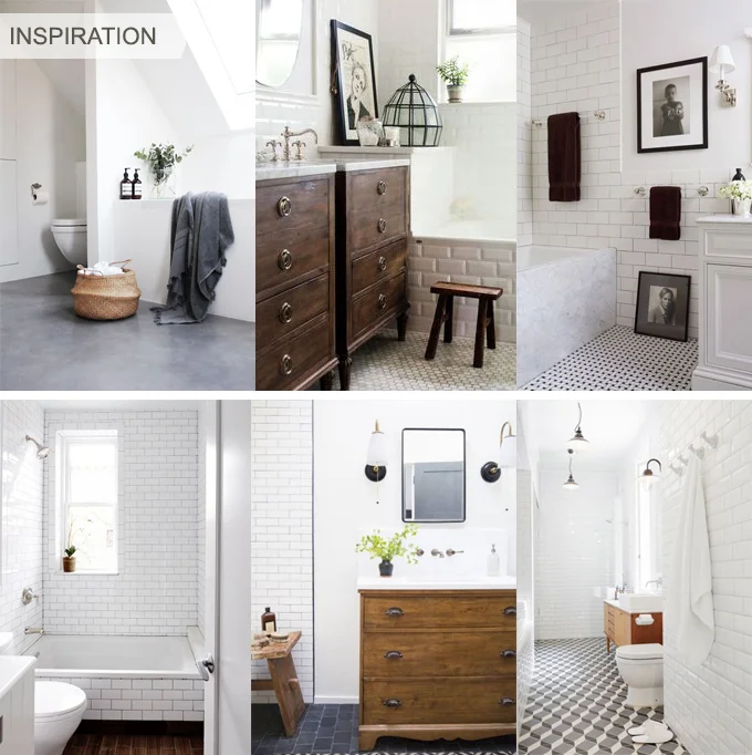
For this bathroom I want something warm and inviting, while my tendency towards all white everything hasn't been lessened one bit. Having started with the grime and dirt encrusted house we purchased and living in the house with it's constant layers of sawdust and paint chips all I want in the world is white clean spaces. With that being said I settled on a warm grey for the walls in this bathroom and the vanity is a dresser we found for $150 at a local resale shop. Other than structural changes so the dresser can hold a stone top and sink, we will be leaving the dresser as-is. The finish of the wood and the grey walls give the room a vintage warmth that contrasts nicely with all the crisp white tile. Speaking of tile the inside of the shower/tub is all white subway tile (affordable and good-looking) and the floor is a 2" white hex tile. Two inch hex tiles are a little bolder and more modern than the teensy 1" hex tile you typically see (that, and since we're tiling ourselves and the 2" tile comes in 1-foot by 2-foot sheets it will make the install go that much faster). This bathroom is filled with light, having two big windows facing east along one wall - and even better, no one can see in through them because the house is so much taller than the neighbors! The feel is equal parts light and bright with a warm, aged, vintage feel so we don't get too far away from the historical spirit of the house. I think this might be shaping up to be my favorite room! We're on schedule to tile within the next could weeks, and we still need to order lights and a mirror. The shower is installed and tiled and I've been taking advantage of the fact that I no longer have to go to the yoga studio to take a shower.

While I wish i could say we're going with brass fixtures in here like in the kitchen, truth be told it's easier (and cheaper) to find chrome. Luckily chrome is of the period and looks really pretty on white tile too. Lately I've been falling in love with some black details  and I'm a total nut for mixing metals - I really like how it's all coming together!

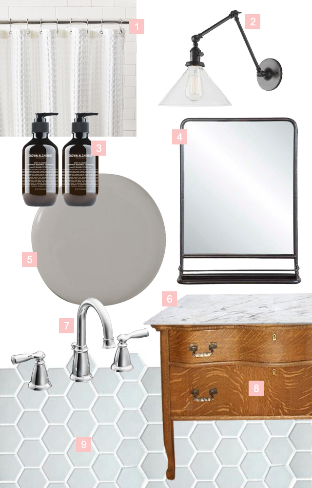
1 | A CLASSIC SHOWER CURTAIN

I finally made the switch from my crazy, oversized teal and brown floral shower curtain to this white waffle weave shower curtain just before I moved out of my apartment and it makes me feel like I'm in a gorgeous hotel every time I look at it. The best part is that it just looks expensive. The guest bathroom with be it's home for now.

2 | VANITY LIGHTING

I'm in love with this articulated light fixture from School House Electric and I've been really digging black as a finish lately too. In a perfect world we would have flanked the vanity mirror with sconces, but this one slipped through the cracks and we only have a single fixture above the mirror - not the end of the world by any means. There is plenty of light in this bathroom and I'm sure a single overhead light is going to be just fine. 

3 | GREAT BODY WASH

This body wash from Grown Alchemist looks good in your shower and feels great on your body. Yeah these aren't exactly a permanent finish in this bathroom, details can make a space. I dream of the day that everything in my house is packaged beautifully and coordinates with each room. Until then, I will continue to hide my piles of product in baskets and drawers.

4 | VANITY MIRROR

I have been in love with this mirror forever. With this bathroom having so much less countertop space I think the little shelf on this mirror could be a big help. I have found a similar, more modern rendition here.

5| PAINT COLOR

Of the 3 things actually installed in this bathroom right now, one of them is the paint color. Deciding the color was actually a happy accident, this color (Sherwin Williams Grey Sanctuary) was supposed to be in the kitchen but ended up looking too muddy in there. We had already purchased a gallon, so we tried it in the Guest Bathroom and voila! it's perfect. Colors change so much from room to room and light to light that I knew this would work somewhere!

6 | COUNTERTOP

The vanity countertop, when we get around to it, will be a slab of Carrara with an undermount, oval sink. Again, just like in the kitchen, we're still pricing and finding just the right piece of stone, so this will probably be the last thing installed in here. Please excuse the obvious photoshop work too...the things I do to try to show y'all whats in my head...

7 | SINK FAUCET

This faucet from Moen matches the chrome fixtures in the bathtub. I am totally a convert to this goose-neck faucet in the bathroom. Once upon a time I was under the (very wrong) impression that I would hit my face on it every time I go to splash water on my face. I couldn't have been more wrong! This faucet shape allows for so much more room in the sink area! I might be in love.

8 | VINTAGE DRESSER TURNED VANITY

This is not our dresser. The only photos I could find of the actual piece we purchased were also terrible (and I'm not about to add to the deluge of awful oak dresser photos online, there are plenty enough as is). This finish is close to what we're working with (minus the tiger-striping) though our shape is a little more simple. The hardware is even pretty close - how cute is that keyhole detail?

9 | FLOORING

The flooring! I'm so excited to finally get this stuff installed. We ordered this 2" hex tile in white from Daltile and the order finally came in in mid August. Tiling is no small feat though and it's taken a little while to just get our heads wrapped around how much we have to do, but now that the paint is up on the walls the floor tile can go in! Cross your fingers we get it done soon!

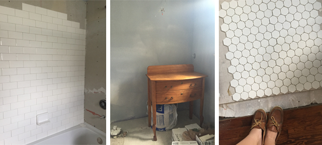
I think this room is really coming together nicely if not slowly. I'll leave you with a few messy little iPhone progress shots of what the space is looking like these days. Hopefully this will be the first room to be 100% completed! (Ok I lied, I am putting another poor quality photo of a dresser into the world...)

Left to right: Shower wall tile mid-install, the soon-to-be-vanity dresser, and the floor tile going in

Left to right: Shower wall tile mid-install, the soon-to-be-vanity dresser, and the floor tile going in